index / work / bubba
Building Bubba
A desk object with an NFC chip in it, and an iOS app that locks your distracting apps until you get up and tap the object. Moulded puck, cast concrete base, brass inserts set into the pour so it comes apart cleanly. The object is the only key.
Live, early access. In testing with 20 people.1 No traction numbers on this page: testing has only just started, and what comes out of it goes in the log rather than here. The physical object is not photographed yet because it is still changing.
| role | sole designer, engineer and manufacturer |
|---|---|
| stack | Swift, SwiftUI, FamilyControls, ManagedSettings, DeviceActivityMonitor, Core NFC, CloudKit, Supabase |
| screens | 11 |
| voice lines | 85 across 15 banks2 |
| hardware | v6 prototype, in-house moulding route |
| testers | 20 |
The mechanism
three parts, and the middle one is the product
The object
A circular recycled polypropylene puck sitting in a cast base, with an NFC tag behind the puck face. It has no battery, no pairing dance and nothing to charge. It sits where you work.
The gate
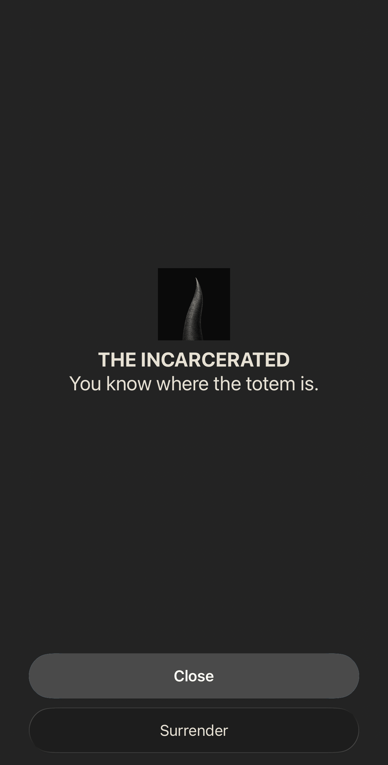
The app selects apps to block using Apple's Family Controls and ManagedSettings, at the system level. Not a timer that nags you, not a screen you can swipe away. The blocked apps do not open.
The walk
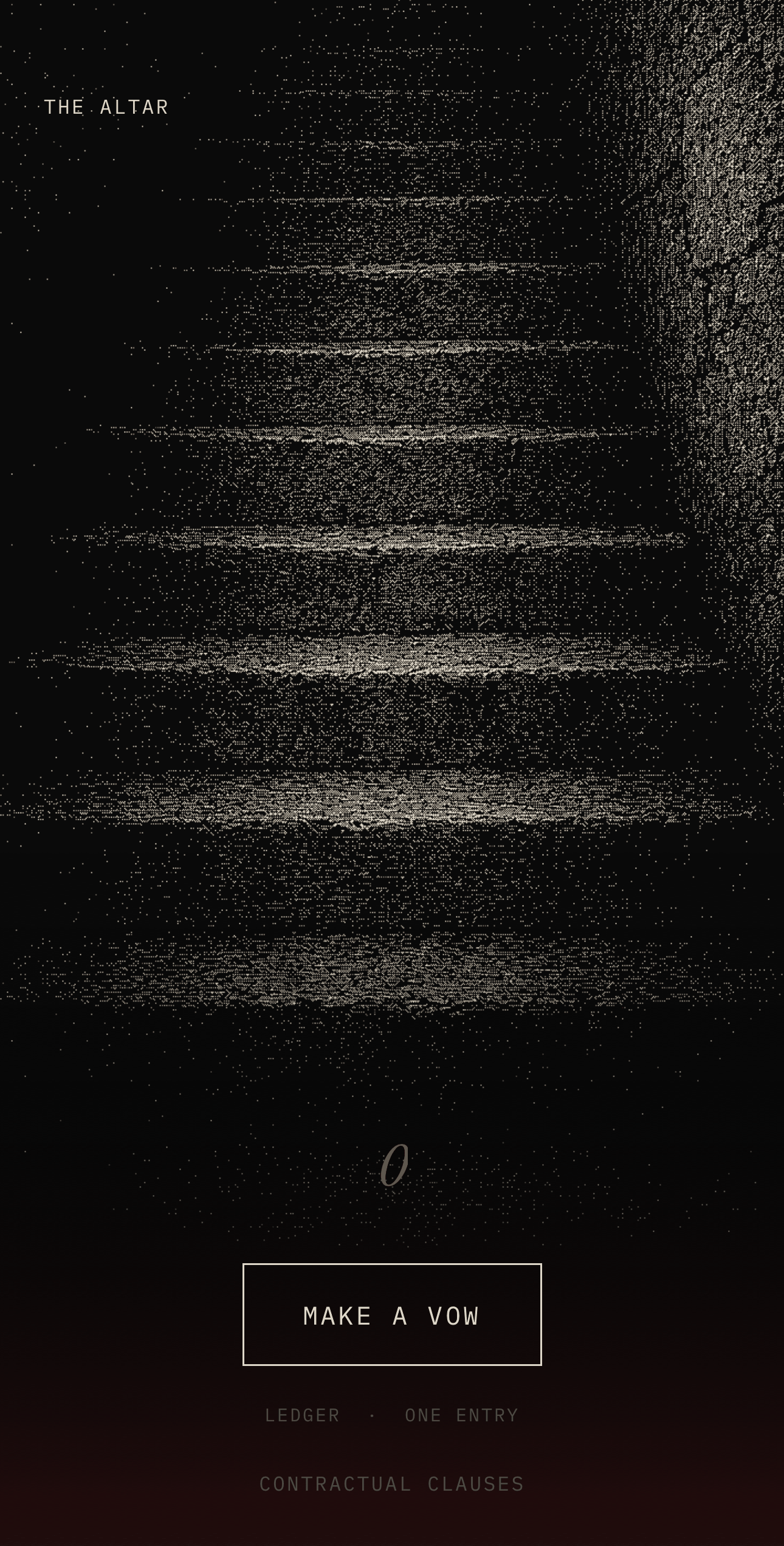
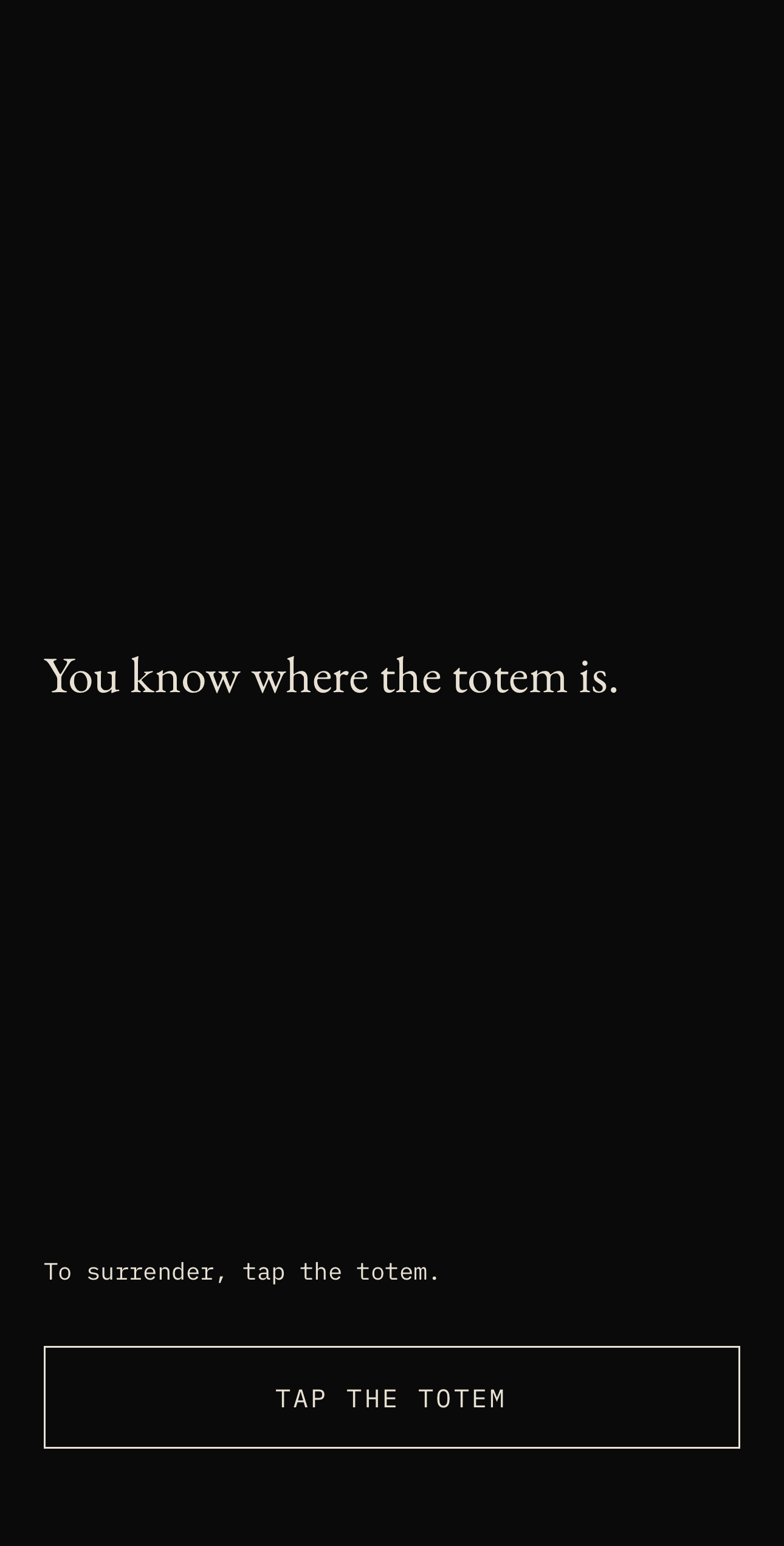
The only way to unlock mid-session is to physically return to the object and tap it again. Tapping opens thirty seconds of a flat grey screen with one line on it, then five minutes of unlocked apps, then the session resumes where it paused.
Every focus app sells discipline. Bubba sells the walk back to the desk, which is the part that actually works.
The distinction matters commercially as well as behaviourally. Software friction can be defeated from the sofa, so it gets defeated. Friction with a floor plan in it does not.
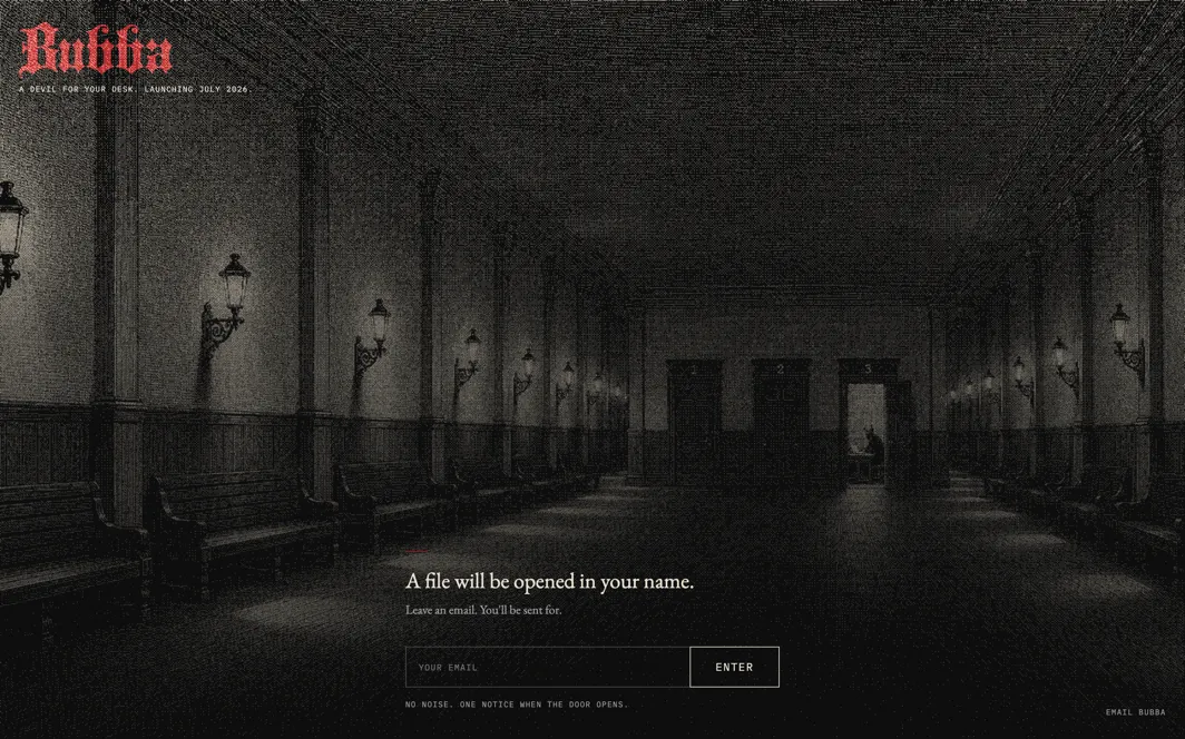
The app
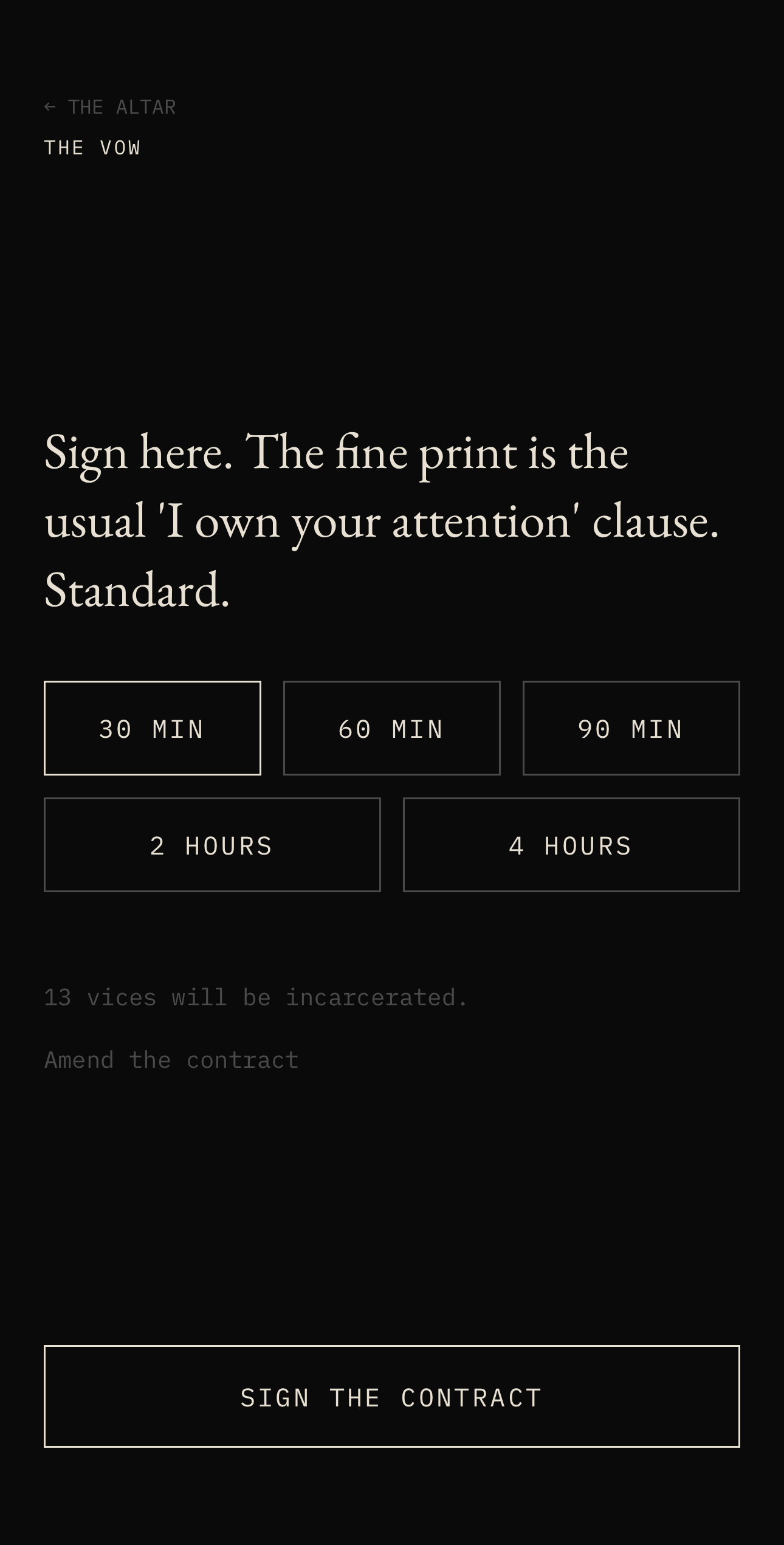
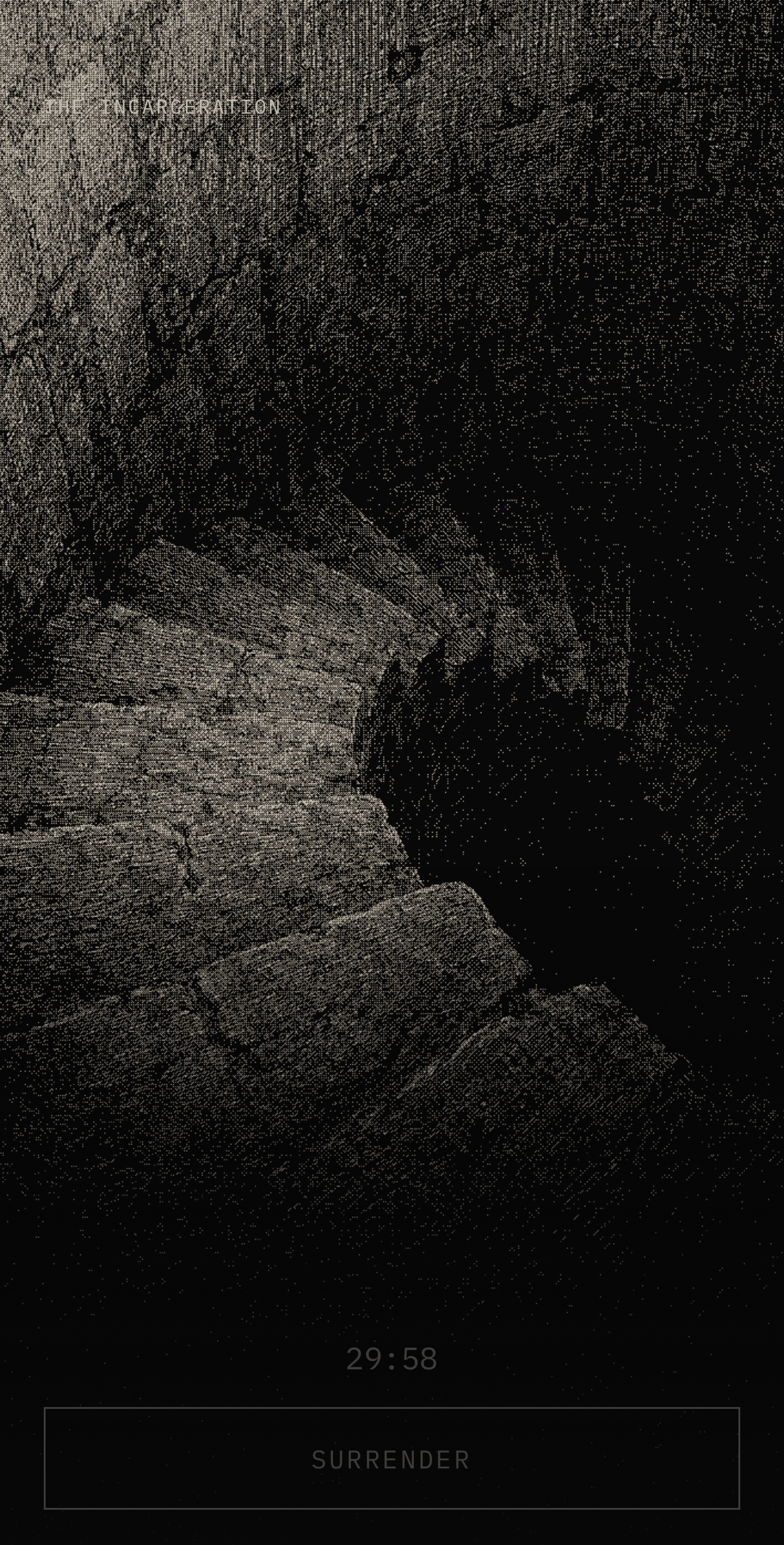
four of the 11 screens, and one that is iOS's
The object
two components, and why they come apart
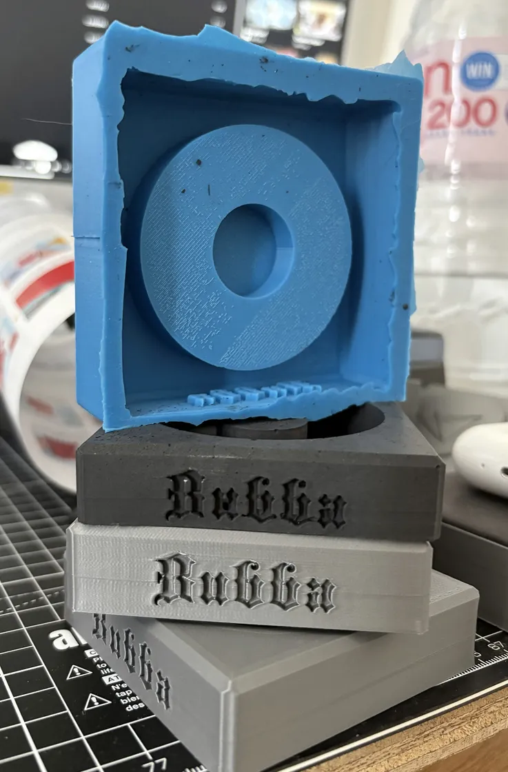
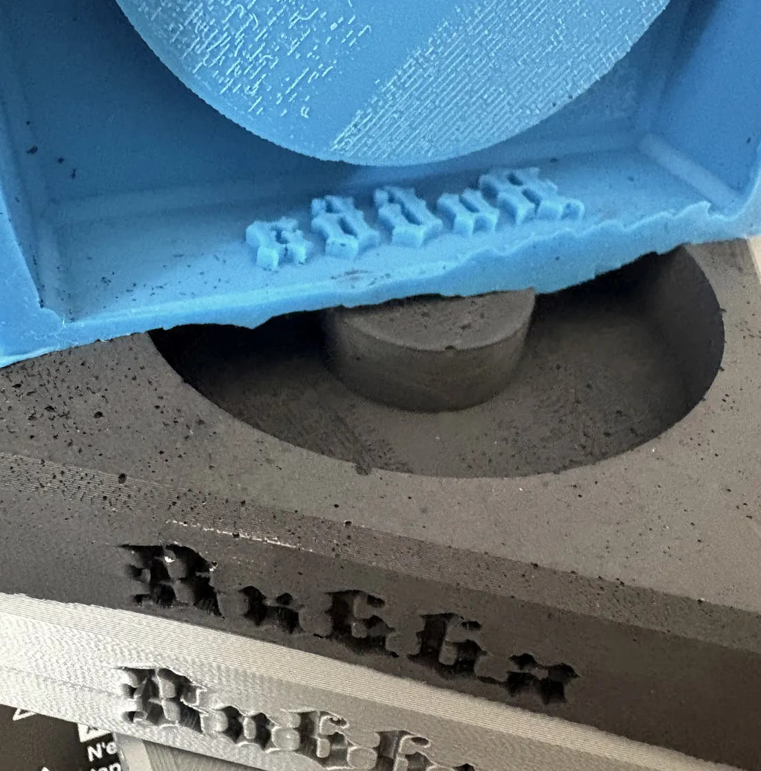
Two components. A black recycled PP puck, partially recessed into a cast Jesmonite base in charcoal, raw finish, no sealer. BUBBA is set into the front face of the base in recessed blackletter, cut into the mould rather than added to the object afterwards. Brass inserts go into the pour so the two halves bolt together and come apart again, which matters for repair, for replacing the tag, and for getting the electronics out at end of life.
The NFC inlay goes in behind the puck face after moulding rather than during it, because the tag does not survive the heat. That is a small decision that changed the assembly order and the underside geometry of the puck. The production chip is an NTAG215, chosen over the cheaper 213 for read lifetime rather than memory: this is an object you tap several times a day for years, so the number of reads it is rated for is the specification that matters.
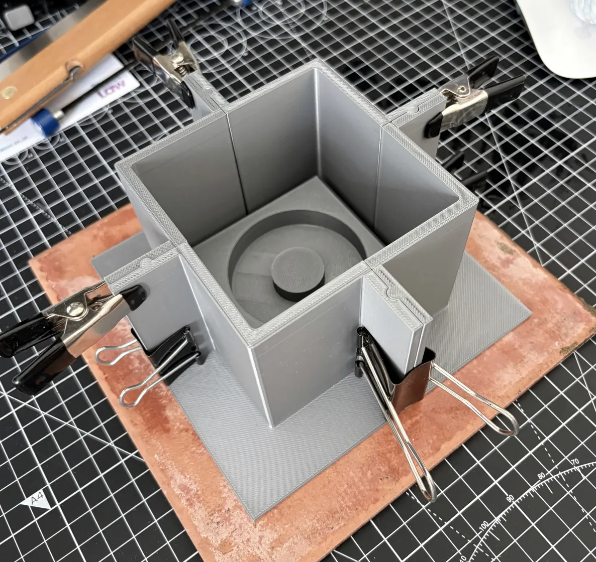
Made in-house rather than tooled out. A desktop injection moulder produces the puck from shredded recycled PP, a printed polycarbonate insert gives the puck its surface, and the base mould is a printed master, cast in silicone, poured in Jesmonite. 6 prototype iterations so far. The reason for the in-house route is not cost, it is that the design is not finished, and a tooled part would have frozen it at v2.
Decisions
drawn from the log
No app without the object.
Install the app without a paired object and you reach a dead end that does not offer a workaround, a trial or a soft version. The product is a £50 object with the software attached, not a subscription with a novelty accessory, and a soft gate would have made it the second thing within a week.
Five durations, no custom field.
30 minutes, 60, 90, two hours, four. A free-text minutes box invites you to negotiate with yourself before the session starts, and that negotiation is the behaviour the product exists to interrupt.
Surrender is an event, not an outcome.
Walking over and unlocking mid-session does not fail the session. Only deliberately abandoning it does. The record shows both, so a completed session that took three interruptions reads as a completed session that took three interruptions, which is the truth and is more useful than a failure.
The clock pauses, it never rewinds.
Interrupting a 60-minute session costs you the walk and the wait, not the 40 minutes you already served. Punishing served time would teach people to abandon sessions instead of returning to them.
One notification.
A single nudge after three days of inactivity, and nothing else. There is no streak reminder, no daily prompt and no re-engagement sequence. An app about not being interrupted does not get to interrupt you.
Red is rationed.
One accent colour, seven permitted uses, written down as a list rather than left to judgement. Two typefaces, no exceptions.
What it actually took
the unglamorous parts
The Family Controls entitlement is granted by Apple case by case, and the APIs behave differently under it than they do in the documentation examples. Sessions have to survive the app being backgrounded and the phone being locked, which is DeviceActivityMonitor rather than an in-app timer, and getting that persistence honest took longer than building every screen in the app put together.
The hardware moved from a supplier route to an in-house one after the first quotes came back. A 500-unit injection moulding quote was on file and viable, and taking it would have meant committing the design before the surface texture, the puck dimensions and the fixing were settled. The printer and the moulder together cost less than that run and left the design unfrozen.
Copy is not written into the interface. Every line the product says comes out of a JSON voice bank, banked by moment, so the tone can be revised without touching a view, and the same line never has to be found in three places. This is the part that will look like over-engineering until the first round of tester feedback says a screen reads wrong.
A field existing in the data does not entitle it to a screen.
The stats screen counts seven things and refuses several more that were easy to compute. Anything that turned the app into a dashboard came out, including the entry count on the home screen, which made a threshold feel like an inbox.
What is not done
known gaps, stated plainly
- The object is not finished. The surface texture is undecided between six candidates, the base material is still to be confirmed against a cement control, and the fixing spec is open until the puck dimensions settle. The photographs of the object are of the base and the mould that makes it, and the moulded puck does not appear in any of them. No photograph on this page is a photograph of a final unit.
- There has been no production run. The moulder is in, the printing route works and the chip is specified. The insert tooling is not ordered, and until a batch of fifty comes off consistently, the manufacturing route is a plan that has worked 6 times.
- No usage data worth quoting. 20 people have access and prototype tags. Access granted is not use, the test period has not closed, and anything I say about behaviour before it does would be a story about 20 people who know me.
- iOS only, and structurally so. Family Controls has no Android equivalent. Android is not a port of this app, it is a different mechanism with the same object, and I have not designed it.
- Accessibility is partial. One screen is deliberately hard to read, which is a design decision with a real accessibility cost that I have not resolved. The dithered imagery needs alternative text that does not sound absurd, and the two-colour palette needs checking properly rather than by eye.

Thirty seconds of this, at low contrast, on purpose. The design decision and the accessibility cost are the same decision. - One reward feature is a placeholder. It has a screen, a definition and no mechanism behind it. It says so on the screen, which is the only reason it is allowed to ship.
Sources
- 20 people in the test group, counted from the tester list. It counts access granted, and says nothing about how many of them use it.
- Screen and voice line counts taken from the build and the voice bank on 3 September 2026. Counts what exists, not what is finished.